
Annual Appeal Season
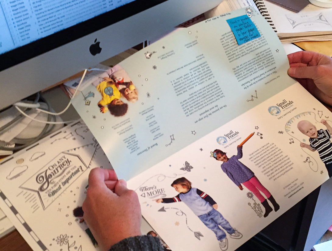
Reviewing a press proof of a direct mail annual appeal.
This time of year I work on many annual appeals for local nonprofits. In this increasing digital world, it’s ironic that direct mail still seems to still be the best way to communicate your message and spur donations. Even as a driver to an online giving campaign, direct mail is a valuable component.
One of the aspects I love about direct mail is the variety of sizes. With so many designers creating for small screens, it’s freeing to design for a larger sizes. Also, how frequently do you we get interesting mail? I still love to look at direct mail catalogs and postcards. And like many people, I save the appeals I receive and go over them when I’m ready to make my annual donations.
Appeals come in a variety of shapes and sizes. But there are three rules that apply to every appeal:
- A clear cause with a compelling message
- A clear ask with a simple response device
- A clean, targeted mailing list

Cover of the Small Friends appeal
While these 3 points might seem like common sense, I’m surprised each year by how many appeals lack clear messaging. Don’t make it hard for me to give, don’t make it hard for me to know what you do, and don’t send it to me if I’m not in your target audience.
It can be shocking how little some nonprofits know about their donors and their donation rituals. Tracking trends in your donations will give you key insights to what kind of appeals are working and which aren’t. It’s also vital to review the donor lists of other neighborhood nonprofits in your area to review potential donors and expand your organization’s contact list. Its vital to have a strong email base for initial contact and follow up. And don’t forget to put an appeal plan in place either for the fiscal year or the calendar year.
This fall, I was asked to design a direct mail appeal for Small Friends on Nantucket. This new piece combined photos of children in Small Friends’ programs with drawings of program activities around a map of Nantucket. I often work with boards, executive directors and organization members and try to take all of their ideas and concerns into consideration when I design an appeal. While this method requires patience on the part of the design team, it often brings to light aspects of the organization that might not be readily apparent. Aspects that could be used in future marketing efforts.
Also, I always keep the budget in mind and design projects that work with the goals of the organization as well a their cost considerations. Direct mail is expensive, but it doesn’t have to be, there are many options. A simple, direct piece with an emotional message is (harder than it sounds) doesn’t have to break the piggy bank’s back. On many occasions I’ve advised clients to forgo complicated pieces in favor of lighter, direct mailers.
Direct mail is a visual medium, keep the text short and the graphics eye catching, and make the message clear!
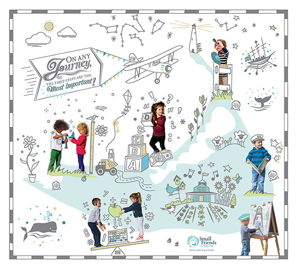
Map graphic, the reveal portion of an annual appeal.